Have you ever seen a logo that looks and *feels* like music? No, neither had I until I saw the rebranding of the San Francisco Symphony! The new brand identity makes use of classic, serif, all caps typography in varying sizes to seemingly represent a crescendo, whilst also mimicking the shape of a trumpet - the brass instrument often occurring as your first thought when you picture an orchestra.
It insinuates to me that the music on show will build up to something bold and fascinating.
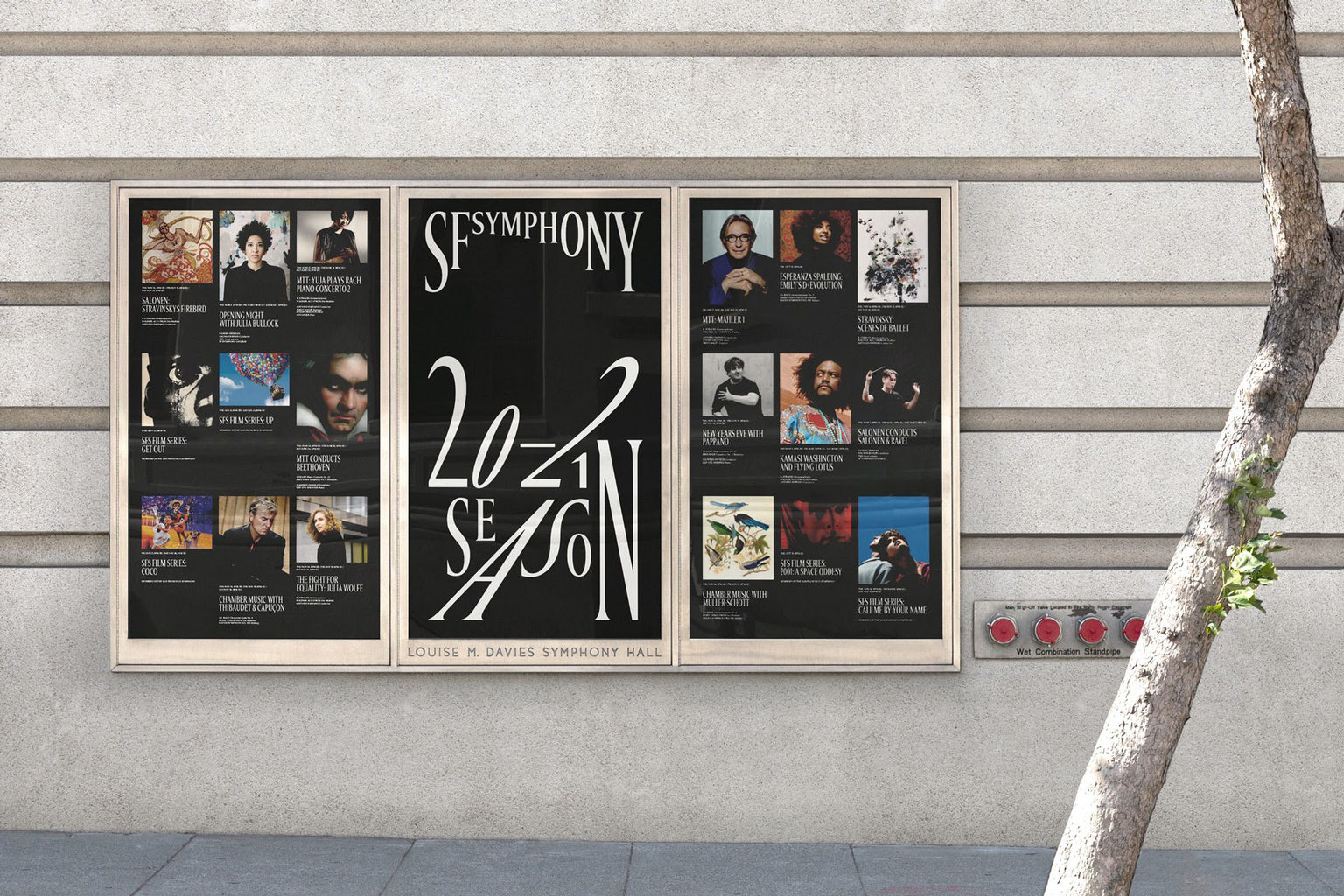
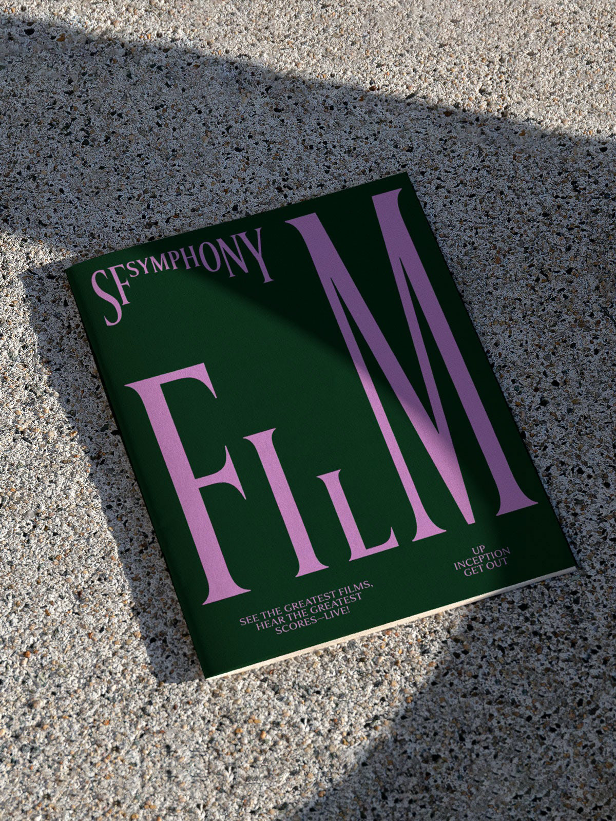
San Francisco Symphony called in design agency Collins, to revamp the current branding, in order to appeal to a new audience. The branding includes variable font technology, as shown in the video below, which adds an interactive element to the online concerts, broadening the appeal to the younger generation and shedding the old world and elitist reputation associated with classical music.
Collins used classic monochromes to convey the timelessness of classical music, as well as vibrant tones inspired by the local Bay Area in supporting artwork.
Overall, this rebranding taught me that seemingly boring industries or businesses can be made interesting, and that we are not confined to using set typefaces and dull icons. We can (and should, where appropriate) modify, animate and get creative - because this is ultimately what will get our work noticed.
