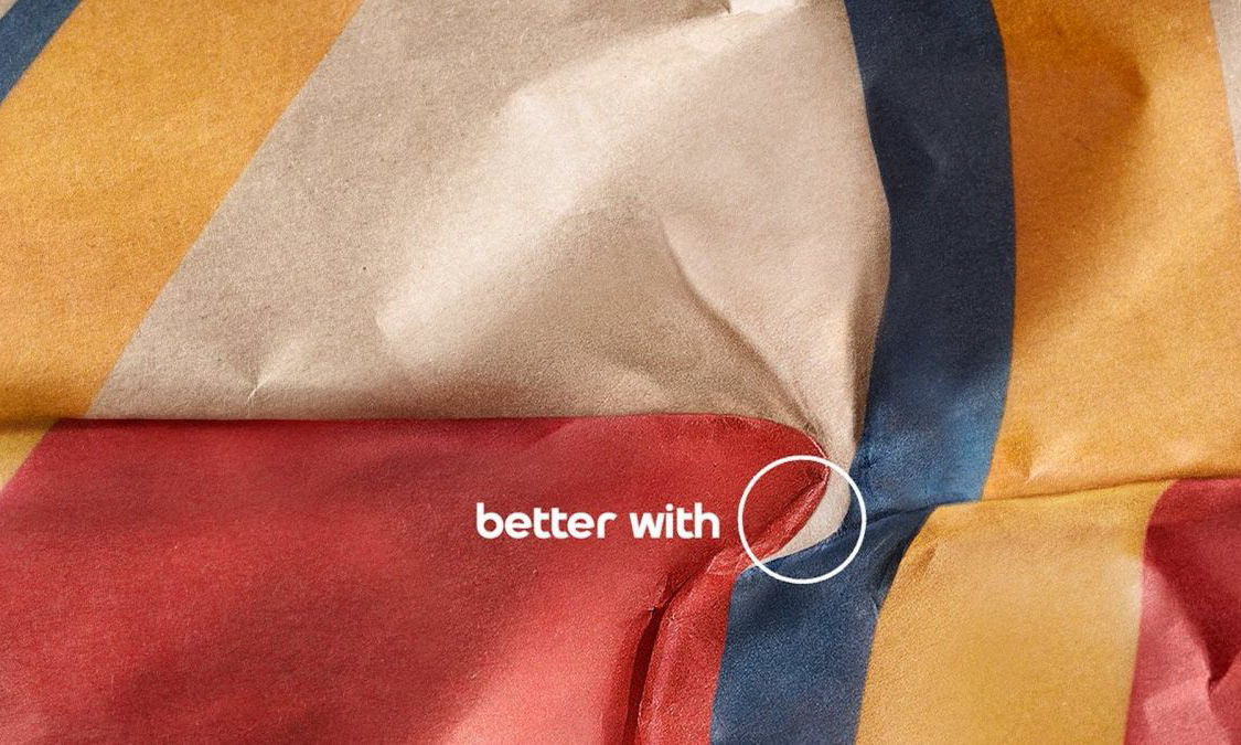
I have always known that McDonald’s have always had very strong branding, however this has been increasingly evident in recent advertising campaigns where they either omitted the logo or in the most recent campaign, only displayed half the logo. This ad is designed to promote McDonald’s home delivery, as the world continues to battle the coronavirus pandemic and the restaurants remain closed for indoor dining.
It makes use of it’s iconic golden arches to convey movement, and before you see the ‘we deliver' tagline, you know the advert belongs to McDonald’s. I love the use of colour, with flat darkened backgrounds, with the bright yellow arches appearing to bring light to the households. This gives a really positive feel to the artwork, and you begin to associate the McDonald’s logo (or half of it!) with being cheered up, or making a bad time brighter.
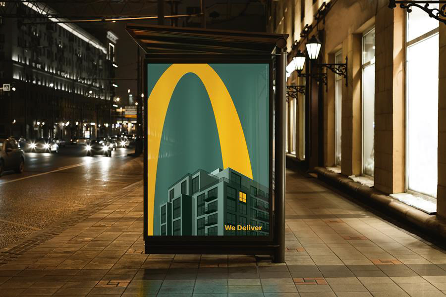
The tagline itself says all it needs to say, in the typeface instantly recognisable as belonging to McDonald’s, as it features so heavily on their packaging and advertising. It works in perfect harmony with the artwork to suggest that ordering McDonald’s will be a positive choice.
All in all, this is a great effort from Leo Burnett agency, and just goes to show that you can adopt minimalist branding in your advertisements when you think smart (but it also helps to have a globally recognised brand!)
